
Summary
I created 30-minute isochrone maps for trips on public transit to see how access on transit changes with the time of day. I wanted to compare TravelTime’s proprietary API with Valhalla’s free, open source alternative (running on my local machine). There are 216 isochrones for each API, one for every 5 minutes from 6am to midnight on Wednesday, November 20, 2024. They can be compared here, where TravelTime’s isochrones appear in red and Valhalla’s in Blue. This project is centered on my home in Atlanta.
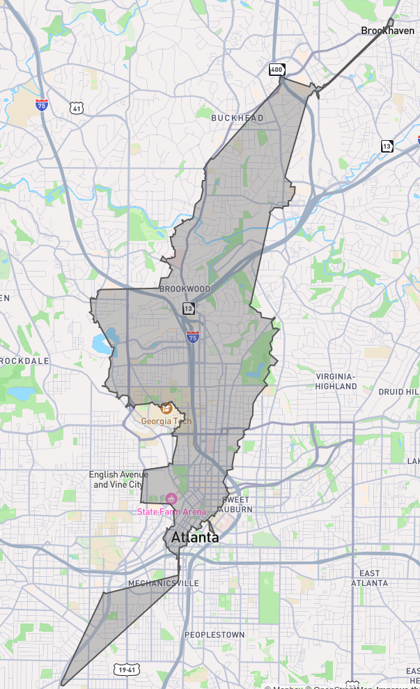
Then I used Valhalla to create 240 isochrones (every 5 minutes from 5am to 1am on the same day) for a point in each one of Atlanta’s 103 Neighborhood Statistical Areas (if they had service, which some didn’t). The origin point for each neighborhood was based on the average location of MARTA stops within it, weighted for the amount of service at the stops. Those can be explored here.
For both pages, the blue isochrones from Valhalla only account for MARTA service, not other operators. The data I generated and the repositories with my code in them can be found at the bottom of this page.
Introduction
In Transport and GIS we have learned to make isochrone maps for driving or walking trips. But even without our simplifying assumptions, routes and isochrones for walking and driving are simple compared to multimodal trips. The motivation for my project was straightforward: I wanted to know what places are reachable within 30 minutes from my home on public transit. But that is not all. As a user of public transit, I am all too aware of how much the amount of time it takes to reach a place varies with the transit schedule. So, what I really wanted to see was how my access to places on transit varies over time as buses and trains come and go.
The choice of 30 minutes isn’t totally arbitrary. Although isochrones are most useful when they show multiple time intervals, I wanted to keep the total size of the dataset from growing too large. I chose 30 minutes because Marchetti’s Constant is a convenient rule of thumb.
Unfortunately, making a trip planner for public transit from scratch is too great a task for one person to take on as a class project. It’s the kind of thing a team of experienced people do for multiple years as their full-time jobs. For the underlying graph, nodes and edges appear and disappear with the time of day according to transit schedules. Every transit trip is multimodal, usually beginning and ending with walking. Unlike the continuous isochrones of walking, biking, and driving, the isochrones for transit are often disconnected, multipolygon shapes with centers on major stations or stops.
Fortunately, the problem is common enough that there are many solutions available more-or-less off-the-shelf.
Selection of Tools
There are a dizzying number of options for software that provides routing services and trip planners. Because of the problem domains’ similarity, many of those options also provide isochrones. However, they often do not support transit as a mode and some that once made isochrones have discontinued their support for that feature.
I picked a few from the list at OpenStreetMap’s wiki to investigate. My goal was to choose whatever looked like the best proprietary software as a service (SaaS) application programming interface (API) and compare its results with free and open source solutions running on my own local machine. Several choices have “playgrounds” where you can test the results of their services without setting anything up yourself. Some of those are broken or only work for a limited geographic area. Of the proprietary solutions available, the TravelTime API stood out. They support plugins for things like QGIS. Unlike almost every other service, they obviously treat isochrone maps as a core product rather than an extra feature. There were also multiple SaaS APIs that are obviously using free open source software on their backends, but TravelTime did not look seem like one of them. (Or, if they did start from an open source project then they have most likely modified it significantly.) Their playground can be found here.
I went down more dead ends looking for open source solutions. I wanted to try GraphHopper, because a project I like in the Bay Area called BikeHopper modified it to create a trip planner for bringing bikes on transit. (As far as I know there are no other services allowing that combination of modes, although Transit App may soon since they recently added bikes as a mode.) Unfortunately, Graphhopper’s documentation does not show transit as a supported mode for their isochrone API and when I tried to use the profile on their test page I received errors. To make matters more frustrating, github issues suggest that what I wanted to do was supported in the past and a forum post suggests it may still be possible, but clearly it won’t be well-documented. So, I moved on.
OpenRouteService supports isochrones, but their api pages did not work well. They also appeared not to support public transit as a mode on that page or on their test map.
The confusingly similarly named OpenTripPlanner explains in their documentation that in the second version (V2) they have tried to move away from analysis applications, including isochrones. V1 is no longer supported. Instead they point to R5, a project some of their contributors run. That project isn’t really structured for this application either, but an R library called R5R uses it to generate isochrones and other access maps. A similar Python library exists, but gets worse support and documentation. I decided to try R5R, but it took over 2 minutes to generate a single isochrone (even with sufficient RAM given to the JVM) and the isochrone’s level of detail was coarse (and seemingly not adjustable). I decided not to use it because of the slow runtime and jagged isochrone shape, but it might be useful to someone else, especially someone who wants an R library. The isochrone and R script can be found in the repository, but below is a screenshot to show its shape.
It’s the top and the bottom that really bugged me. I think it tries to force the isochrone to be one continuous shape. But for transit, it won’t be
Valhalla is the free open source option that I already knew about at the start of the project and planned to use, but I had hoped one of the above would also work. Valhalla uses a hierarchical graph model, inspired by map tiles, so that it runs better in resource constrained environments. It is the open source solution behind multiple MapBox APIs (and probably also those of many other companies). It is used by Tesla for their integrated in-vehicle routing. Best of all, it has decent isochrone API documentation and a third party Docker image maintained by gis-ops.
Querying TravelTime
Querying the TravelTime API was relatively simple. I made an account and generated an API key. I created an example query based on one from their playground. Then I wrote a for loop in a Jupyter notebook that changed the time of day, sent more queries, and saved the responses. I ran the notebook in a few batches, changing the loop’s start and end times, and checking the results. All of the queries were based on Wednesday, November 20, 2024. The first isochrone was for 06:00 and the last was at midnight, with a 5 minute interval between each one.
The only challenges were created by limitations on the free tier of the API. It limits the number of requests per minute, so that I had to set a timer in my loop between requests and add error handling to try again in case one was rejected. They also limit the total number of requests, which I did not realize. Thankfully, when you go over they pester you with emails instead of rejecting your requests. In all, it probably took a little under an hour for the queries to run, because they could be sent in groups of 5.
The function to create the queries looked like this:
def create_query(location, first_time, time_interval,
                 batch_size=5, max_travel_time=1800):
    query_json = { "departure_searches": [] }
    query_time = first_time
    for i in range(batch_size):
        query_time = first_time + time_interval*i
        search_query = {
            "id": "isochrone-" + query_time.isoformat(),
            "coords": {
                "lat": location[1],
                "lng": location[0]
            },
            "departure_time": query_time.isoformat(),
            "travel_time": max_travel_time,
            "transportation": {
                "type": "public_transport",
                "walking_time": 900,
                "cycling_time_to_station": 0,
                "parking_time": 0,
                "boarding_time": 0,
                "driving_time_to_station": 0,
                "pt_change_delay": 0,
                "disable_border_crossing": False
            },
            "level_of_detail": {
                "scale_type": "simple",
                "level": "medium"
            },
            "no_holes": False,
            "polygons_filter": {
                "limit": 100
            },
            "snapping": {
                "penalty": "enabled",
                "accept_roads": "both_drivable_and_walkable"
            },
            "render_mode": "approximate_time_filter",
            "remove_water_bodies": True,
            "range": {
                "enabled": False,
                "width": 3600
            }
        }
        query_json["departure_searches"]
            .append(search_query)
    return query_json
All of this was done in the query_travel_time_api.ipynb file in the
repository.
Querying Valhalla
First, Valhalla needed to run locally on my machine. I already had Docker installed, so this was just a matter of running and configuring image linked above. The documentation for the image is relatively good, but must be read closely to work with transit. I downloaded the necessary osm data from Geofabrik for the state of Georgia here and the most recent GTFS data for MARTA from transit.land here.
The command I ultimately ran (after some trial and error to determine the configuration of environmental variables) looked like this:
$ docker run -dt --name valhalla_gis-ops -p 8002:8002 -v
  $PWD/valhalla_files:/custom_files -v
  $PWD/gtfs_files:/gtfs_feeds -e build_time_zones=True -e
  build_transit=True
  ghcr.io/gis-ops/docker-valhalla/valhalla:latest
Where gtfs_files was a directory containing a directory called oct2024 with
the latest MARTA GTFS schedule in it and valhalla_files contained the osm
data. After running the command, valhalla_files would also contain a number of
other Valhalla data.
Next, in a Jupyter notebook I wrote a query and loop to create isochrones for the same times as above. The function to create the json object for the query looked like this:
def create_query(location, date_time):
    return {
            "locations": [
                {
                    "lat": location[1],
                    "lon": location[0]
                }
            ],
        "date_time": {
            "type": 1,
            "value": format_date(date_time)
        },
        "costing": "multimodal",
        "contours":[
            {
                "time": 30.0,
                "color":"ff0000"
            }
        ],
        "polygons": True,
        "denoise": 0
    }
The denoise parameter controls how much the polygons are simplified (a higher
value will create coarser, more jagged shapes like the R5R example above). The
Valhalla data was computed very quickly.
It ran so fast, in fact, that I decided I had time to generate similar
data for each of Atlanta’s 103 Neighborhood Statistical Areas (NSAs). For each
NSA, I needed to select a representative location. To do that, I used the GTFS
stop locations and chose the weighted average stop location within each area after
assigning weights the stops for their frequency. (That was done in the
transit_centroid.ipynb file.) Then I iterated over those locations in an outer
loop with an inner loop similar to the one above that iterates over departure
time. I also changed the boundaries to be wider (5am to 1am) because I sometimes
take MARTA after midnight. (And because there is no limit to my number of API
requests on my local machine.)
The data for Valhalla was generated with the query_valhalla.ipynb file.
Formatting the Data
After running the notebooks to query those APIs, I had three folders with a high
number of geojson files from their responses: Two folders with 216 geojson
files from my condo to compare the two APIs and one containing 103 NSA
subfolders with 240 geojson files each to see different neighborhoods. I
reformatted those into gpkg files.
This would allow for smaller total file size when I eventually served them over the
web. The alternatives were to load each isochrone’s geojson file separately when
I visualized the data
(which would make the visualization way less responsive due to latency) or to
combine them into a huge geojson file (which would be a much bigger file size
than gpkg and make load times even worse). The gpkg files would also be easier
to use for future analysis. This data wrangling is done in the
combine_geojson_to_gpkg.ipynb file.
Visualizing the Data
For this, I used JavaScript and a few libraries. I used Leaflet for mapping. I used leaflet-geopackage to use gpkg instead of geojson for data layers. And I used Bootstrap, quite lazily and unnecessarily, to avoid thinking even a little about CSS. For map tiles, I used MapTiler.
I started the project using npm, Vue, and Vite but then using build tools again made me question every decision I had made in my entire life to bring me to that moment. Unresolved philosophical questions about the nature of causality unfolded in my mind like I had opened Pandora’s box. Was I debugging JavaScript build errors because I tried to edit HTML to express my budding teenage identity in the MySpace era? Would I be doing this if I had not become enamored with computers after I asked for and received a Game Boy Color with Pokemon Yellow for Christmas in 1999? The only way to stem the flow of intrusive thoughts was to do the project in vanilla JavaScript and forgo optimizations like tree-shaking.
For the user interface, I added buttons to increment and decrement the isochrones by one 5-minute interval, similar to flipbook animation. I also added a slider to track through the time of day quickly. On the comparison page between TravelTime and Valhalla, I made TravelTime’s isochrones red and Valhalla’s blue. For the neighborhoods, the isochrone view only appears after selecting a neighborhood and also includes a “back” button to return to the neighborhood selection view.
To put the files the web, I used a $6/month DigitalOcean droplet running Nginx. All of the files are static, so nothing else is needed. In the future, I will use the same droplet to serve any other static data and possibly move this site to it as well.
Both pages look fine on mobile too.
The pages for visualizing the data are in the visualization_files directory.
However, they require data to be in the src/assets subdirectory that
I was unwilling to commit to the repo because of its size. If you want to
recreate the behavior locally, then you will need to download the data from my
website with the links at the bottom of this page, or just edit the source to
point to my website rather than the local directory.
Reflection
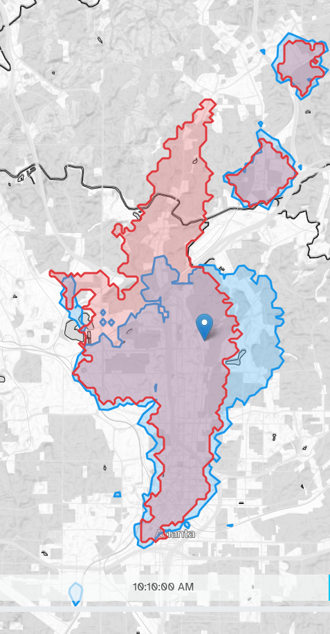
The Valhalla isochrones are pretty close to those generated by TravelTime, but there are a few persistent discrepancies. Some are easy to explain. First, when I queried the TravelTime API, I limited the amount of walking time to 15 minutes (based on the default in their playground) without realizing the same option is unavailable in the Valhalla API. As a result, there is consistently a larger continuous area around the starting point for the Valhalla isochrones that corresponds to trips where someone walks more than 15 minutes. In general, the isochrones from TravelTime are more configurable/flexible and offer more parameters to customize.
The second easy explanation for discrepancies is that my local Valhalla image is only using the most recent MARTA GTFS file. There are other operators besides MARTA that could have been included, like Georgia Tech’s Stinger Bus. Valhalla supports multiple GTFS files, I just didn’t include them.
I wish I had a good explanation for why TravelTime thinks I could get so much farther on the bus extending north from the center here.
There are other differences I can’t explain, like how much farther TravelTime expects a person taking the 101 bus on Peachtree Rd to get if they leave at 10:10AM (shown above). Similar things happen a lot though (e.g. 12:55pm on both the 27 to Cheshire Bridge Rd and the 37 to Defoors Ferry Rd). There are a lot of tiny, awkward shapes for the Valhalla isochrones that result from setting the denoise parameter to 0 rather than some other very low value.
Something that stands out to me is that frequency increases coverage a little where it is focused, if we interpret isochrones as a proxy for coverage. That observation is obvious, but I think of the two as at odds with one another because of the trade-off Jarrett Walker describes in his book, Human Transit. (See this blog post for a summary of the trade-off. There’s a journal article to cite too at the bottom, but the blog post is so clear and succinct.) I don’t think this diminishes Walker’s points at all, since he’s actually talking about ‘coverage’ in a related, yet different sense. I just found it interesting.
Another observation, from the neighborhood access visualization, is that buses running along high speed corridors can actually create quite large isochrones. This happens in places like NW Atlanta, where the 12 runs, but I wonder if they serve areas that people will actually want to walk so far at the starts or ends of their trips.
Remaining Questions and Future Work
The visualizations could most obviously be improved by adding the transit routes to them, probably using something on either this page or this one. What I have been doing is cross referencing the web map at transit.land. When they’re visualized, they should implement the best practices of system maps off the web, like indicating frequency with strength of line, which no web map that I’ve seen does. My hope would be that visualizations like this could become tools for people to understand how they can use transit.
It would also be interesting to study the characteristics of areas whose isochrones vary with different patterns. What demographics have more consistent access on transit when measured with these varying isochrones?
One question that I had for the duration of the project, but never settled on an answer to, is “what transit isochrone should be used if we only assign one to a place?” I believe the most common answer would probably be an average, which is easy/convenient. Yet as a transit user, I find myself planning for a bad (if not worst) case scenario more often than averages.
Finally, there is the question of the accuracy of the isochrones generated by either API. Other than trying to take the same trips, I’m not sure how to validate them. One way might be to use a trusted trip planner (my favorite is Transit App) to see its estimate of how long it will take to reach the edge of an isochrone at the same start time.
Repository
I uploaded my code to sourcehut, which is like GitHub for people who don’t even know where to begin when you ask them why they hate Microsoft so much.
The repo is here.
Some of the code is a bit messy, but what it does is simple, so it should still be easy enough to follow.
Data Sources:
- MARTA GTFS from transit.land
- Neighborhood Statistical Areas from the Atlanta Regional Commission
- OpenStreetMap/Geofabrik for Georgia to building Valhalla network
- OpenStreetMap/MapTiler (for displaying base map)
- Valhalla
- TravelTime
Created Data:
- Geopackage of shapes to compare Valhalla to TravelTime download
- Geopackage files for each neighborhood’s isochrone can be downloaded from
https://isochrones.dyl.land/src/assets/neighborhood_isochrones_gpkg/{NSA_ID}.gpkgwhere{NSA_ID}is replaced with something likeNSAJ02from the data source listed above.